Why Side-by-Side Text Can Ruin Your Message
- Tom at KAPOW Creative
- Jul 17, 2025
- 1 min read


Today’s design fails are brought to you by… side-by-side text layouts.
Remember: in English, we read left to right. When words and phrases are split into separate columns, or staggered side by side, readers can easily get confused about the intended order of the message.
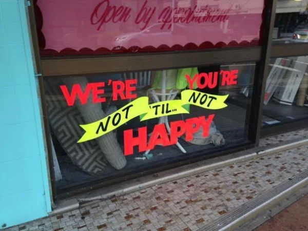
Take these examples — a burger shop accidentally encouraging you to “say yes to drugs,” a brochure that leaves you unsure whether you’re learning to “design” or “lead,” and a shop window that claims “you’re not happy” while simultaneously saying “we’re not happy.”
All of these share the same flaw: they force readers to jump around and guess at the right sequence of words. Apparently we're to forget about Bella and Edward, drive high and Robert needs to just give up.
When designing, prioritize clarity. Keep your phrases linear and logical, and always consider how the eye naturally moves across the full message - left to right - top to bottom.


Comments