When F + Art = FART: A Typographic Cautionary Tale
- Tom at KAPOW Creative
- Jun 26, 2025
- 1 min read

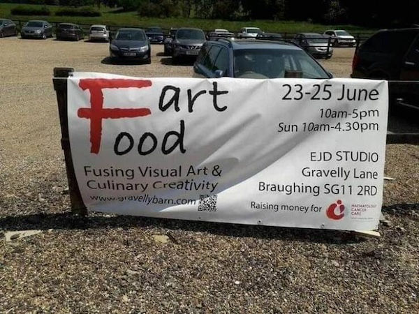

Typography is powerful—but it also has the potential to backfire hilariously when not handled carefully. Here are three real-world design fails where the word "Art" collided with a stylized "F" to form the unfortunate and unforgettable word: FART.
From fashion boutiques to food festivals and water fountains, these examples all fell victim to the same oversight. Whether it's stacked text, overly stylized fonts, or poor layout hierarchy, the result is the same: a juvenile giggle—and a branding moment you didn’t intend.
Design tip? Always get a second set of eyes on your work. Better yet, get a 14-year-old boy to proof it. If they laugh, it’s time to rethink your layout.


Comments